THE PURPLE SUPPER

Epilepsy Queensland
Services
Brand Design Refresh
Logo & Identity Design
Project Overview
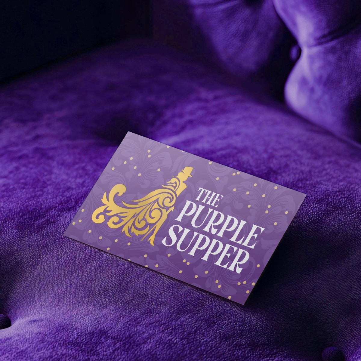
The Purple Supper is Epilepsy Queensland's annual gala — a Brisbane institution that brings together supporters, advocates and the broader community to raise funds and awareness for those living with epilepsy. The event had a name and a following, but its visual identity hadn't kept pace with its ambitions. For the 2026 event, the team wanted something with more character, more presence, and a look that felt worthy of the night itself.


The Challenge
The existing brand was functional but flat — it didn't capture the warmth, theatricality or sense of occasion that the event actually delivers. The brief was to lean into an art deco aesthetic and bring in a stronger performance sensibility, giving The Purple Supper a visual identity that could hold its own on a gala stage. The challenge was striking the right balance: elegant and considered, but with enough personality to stand apart from the sea of generic charity event branding.


The Solution + Results
I developed a new logo and brand identity built around art deco influences — structured geometry, refined typography and a sense of drama that suits both print collateral and large-format event signage. The result gave The Purple Supper a distinct visual voice it hadn't had before. When the event launched in 2026 it was well received by attendees and the Epilepsy Queensland team, with the new identity landing exactly the elevated, memorable tone the rebrand was designed to achieve.

